Tips for Choosing Calm Colors to Create a Serene Home Atmosphere
Creating a peaceful and calm environment at home starts with the colors you choose for your walls and decor. Colors impact our mood and energy, so selecting calm hues can turn your living space into a serene retreat. Whether you’re painting a single room or your entire home, this guide will help you understand how to pick calming colors that suit your style and lifestyle.
Why Choose Calm Colors?
Calm colors are essential for spaces meant for relaxation, such as bedrooms, living rooms, and reading nooks. These colors typically have soft tones and understated vibrance, helping to lower stress and promote a sense of tranquility. Using calm colors can also make your home feel more spacious and inviting.
Popular Calm Color Choices for the Home
Here are some widely loved calm colors that can create a soothing atmosphere:
1. Soft Blues
Blue is often associated with the sky and ocean, embodying peace and openness. Soft blues encourage relaxation and clear thinking, making them ideal for bedrooms or bathrooms.
2. Gentle Greens
Green reflects nature and growth. Light, muted greens are refreshing without being overpowering. They work well in living areas and kitchens where you want a fresh but calm environment.
3. Warm Neutrals
Beige, taupe, and warm grays give a cozy, understated warmth. These colors are incredibly versatile and create a natural backdrop that complements other accent colors.
4. Pale Lavenders and Lilacs
These hues add a subtle touch of color while maintaining softness. They are great for bedrooms or creative spaces where calm focus is desired.
5. Soft Pinks and Peaches
Muted pinks and peaches can add warmth and comfort. These shades are subtle enough to relax without feeling overly sweet or vibrant.
Tips for Choosing the Right Calm Colors
Choosing colors that promote calmness requires more than just picking your favorite hue. Here are some practical tips to guide your process:
1. Consider the Room’s Purpose
Think about how you use the room. Is it a space for rest, socializing, or work? Bedrooms and meditation areas benefit from cooler colors like blues and greens, while living rooms can handle warmer neutrals.
2. Test Color Samples in Different Lighting
Lighting changes how colors appear. Paint small patches on the wall and observe them at various times of day before committing to a color. Natural light brings out different hues compared to artificial light.
3. Choose Matte or Satin Finishes
High gloss can be too reflective and intense. Matte or satin finishes absorb light softly, enhancing the calm effect of the color.
4. Limit Bright and Bold Accents
While accents can add personality, keep bold colors minimal if you want to maintain calmness overall. Use them sparingly in pillows, artwork, or small decor pieces.
5. Coordinate with Existing Furniture and Textiles
Ensure your chosen colors work well with your furniture, curtains, and rugs. Creating a cohesive look helps maintain a balanced and calm feel.
6. Use Color Psychology for Additional Insight
Certain colors may evoke specific feelings beyond calmness. For example, blues can lower blood pressure, while greens are associated with harmony. Learning these can help hone your choices.
Combining Calm Colors with Other Design Elements
Creating a calming home isn’t just about paint color. Consider these complementary design elements:
Natural Textures
Incorporate wood, stone, cotton, or linen to bring warmth and softness alongside calming colors.
Soft Lighting
Use lamps with warm bulbs and dimmers to control lighting intensity. Soft, indirect light deepens the calming effect.
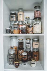
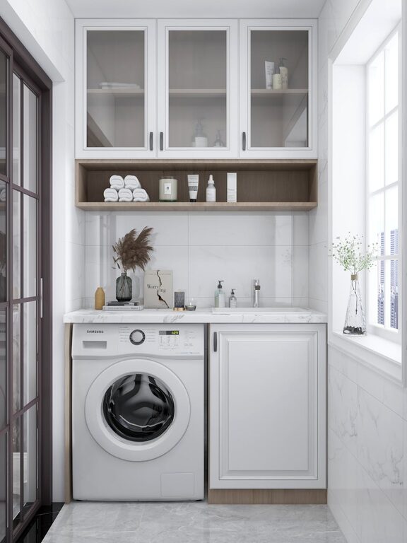
Minimal Clutter
A tidy space feels more relaxing. Pair calm colors with organized storage solutions to reduce visual chaos.
Plants and Greenery
Indoor plants add life and subtle vibrancy while supporting the soothing atmosphere created by calm color palettes.
Mistakes to Avoid When Choosing Calm Colors
– Choosing colors based only on trends: Trends change quickly. Pick colors that feel timeless and personally soothing.
– Ignoring undertones: Some colors may have cool or warm undertones that don’t match your desired effect. Check samples carefully.
– Overwhelming the space: Even calm colors can feel too much if used in large saturated areas; break up space with complementary neutrals.
– Neglecting personal preference: What is calming to one person may not be the same for another. Choose colors that genuinely make you feel comfortable.
Final Thoughts
Choosing calm colors for your home can greatly enhance your comfort and well-being. By understanding how color affects mood and applying thoughtful techniques, you can create a serene, welcoming space tailored to your lifestyle. Remember to take your time testing colors and coordinating with your existing decor — the end result will be a peaceful environment you look forward to coming home to.
—
Feel free to explore calm color palettes online or visit paint stores to get inspired. With patience and creativity, you’ll transform your home into a tranquil haven. Happy decorating!